
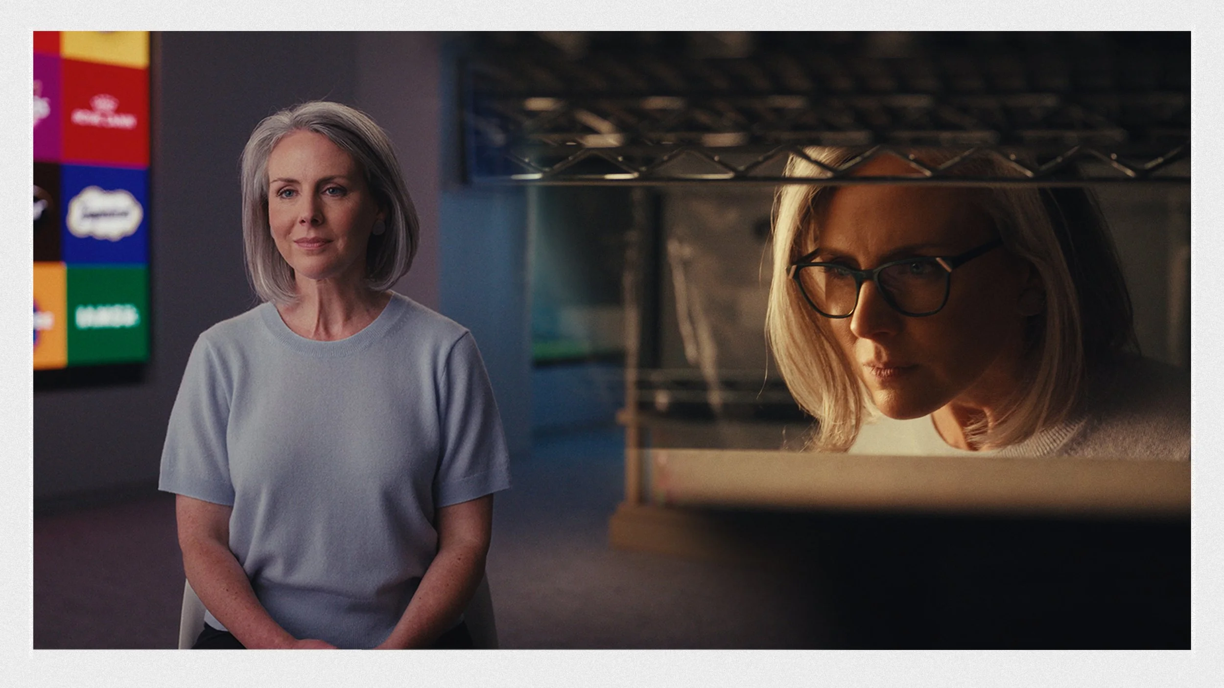
Branded Documentaries: Creating a Look
Branded documentaries can sometimes feel contradictory. You want to shape the scene to best tell the story while also keeping things authentic. Knowing when and how to move between commercial and vérité filmmaking is an important skill to learn as a cinematographer.
My name is Ahmad and I’m a Director of Photography in Washington D.C. - working on documentaries, commercials, and narrative films. In this guide, we'll discuss how and why we created the look for a recent branded doc.
What is a branded documentary?
They're essentially commercials that have a level of realism to them. The client wants something authentic but also controlled. In many branded docs, you aren't necessarily shifting what will happen on camera, you're just giving the action a look/environment that will compliment the message.
When thinking about a look
More times than not, the client has a strong brand of their own. An important consideration here is to live within and respect that brand. Realistically, the amount you can shape the environment can vary heavily depending on your resources and available locations. A path to least resistance here would be to determine if it's a bright/uplifting brand vs a moody/contemplative one. Most things fall within one of those.
Some up-front considerations
Story should be the main driver here. Making things look cool ≠ good cinematography. If the look you can create doesn't support the story, then it should take back seat.
A sensitive subject matter can also be a reason to have a smaller footprint as big lights may cause your character to feel shy or constricted on camera. It's not worth a beautiful shot if the scene doesn't do what it's supposed to.
In some circumstances, natural light may be the best option. Cameras are pretty light-sensitive these days, and you can get a great look by just turning off overheads and letting windows play.
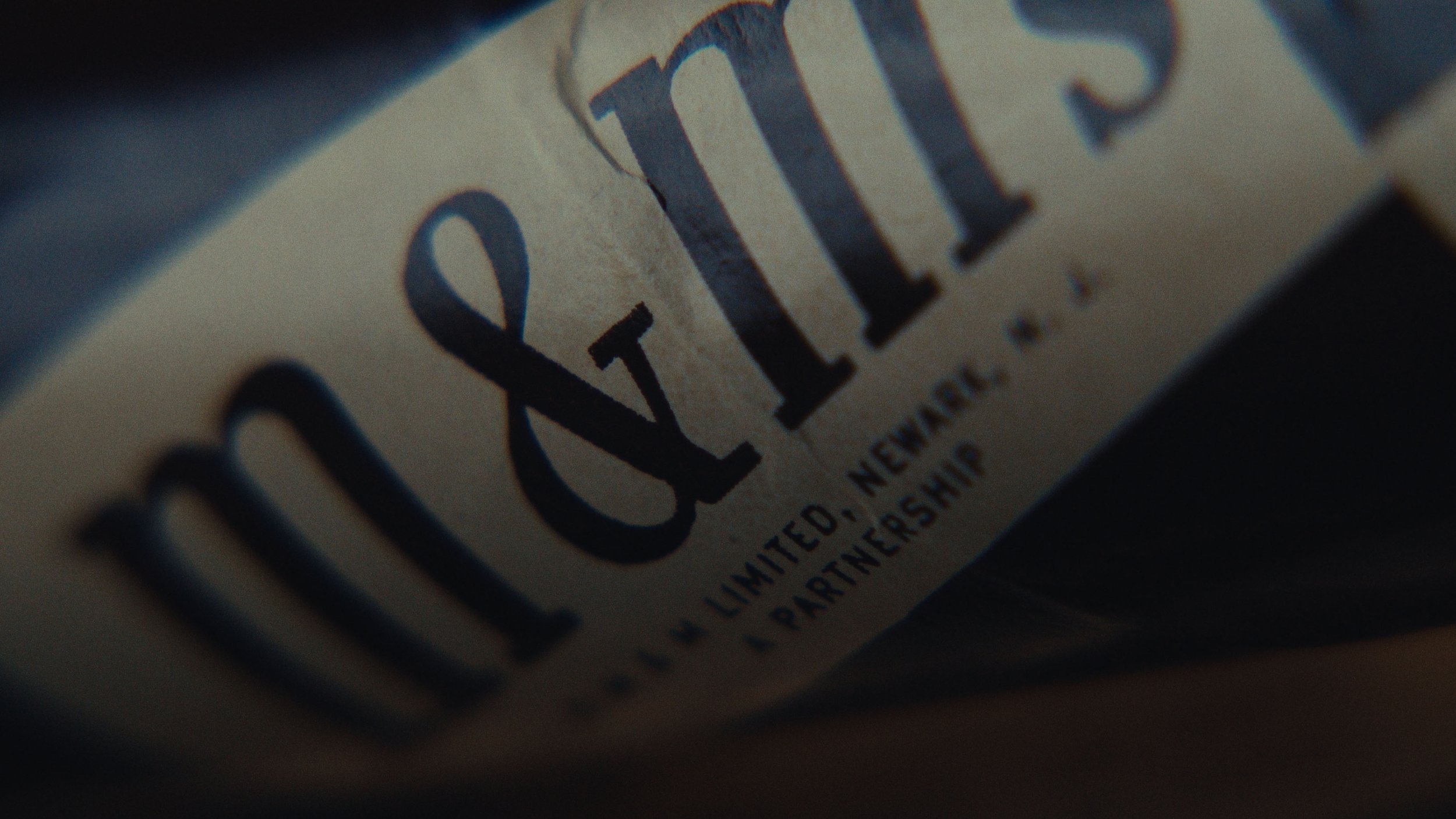
Let's look at a project for MARS Inc.
In early conversations, the director noted that he didn't want this to feel like a traditional corporate documentary and was looking for something more stylized. Being open to that can really elevate the story.
The Interview
When entering a space, I'm always looking for ways we can leverage depth - both physically and with colors. Windows are a big consideration, but this space didn't have any. They did have a video wall though, which they've generally just used as a full backdrop. That can be great but we wanted to use it sparingly to utilize the physical depth in the room.
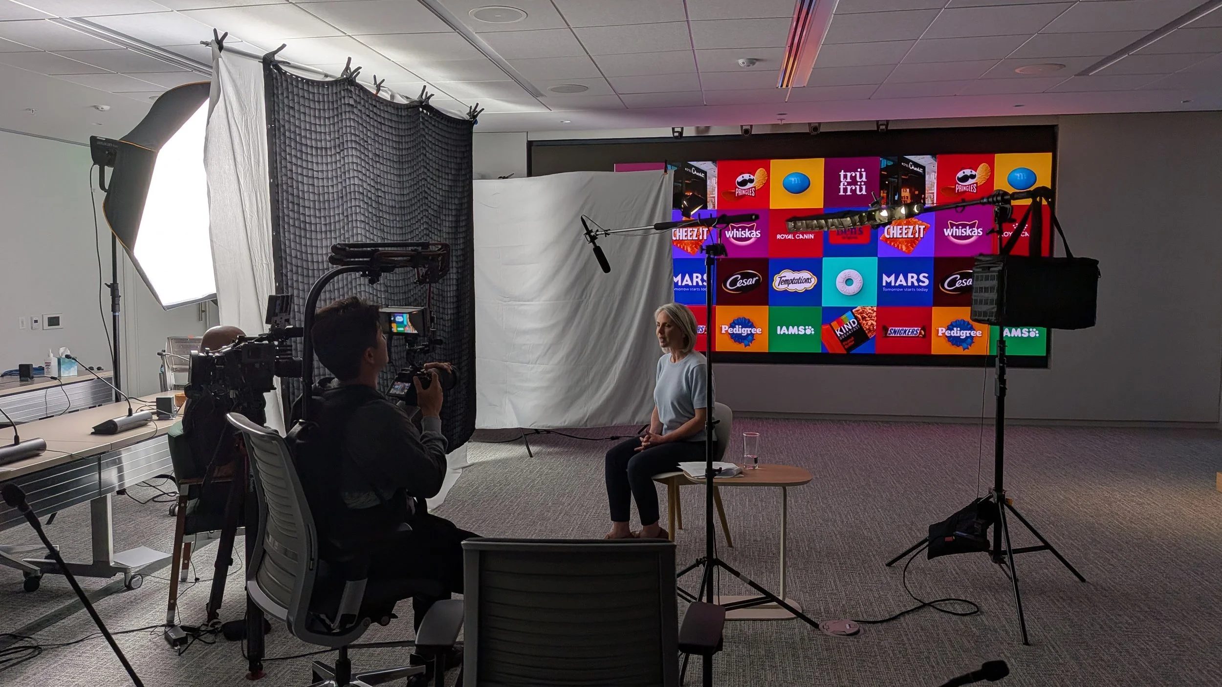
For reference, here's the initial frame we set up when we got to the location:
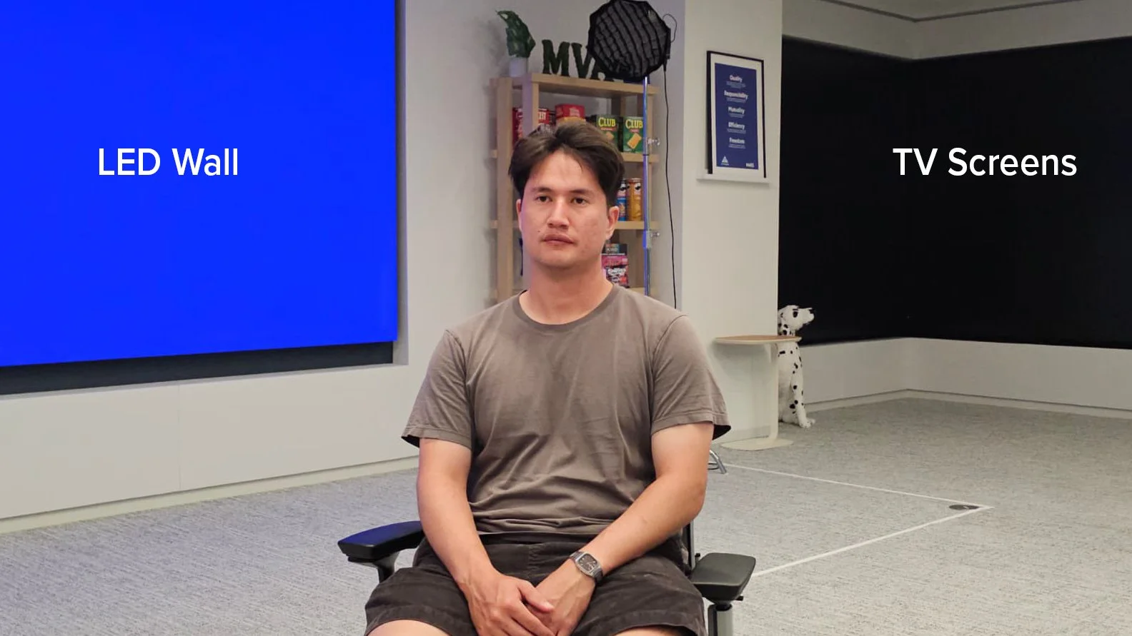
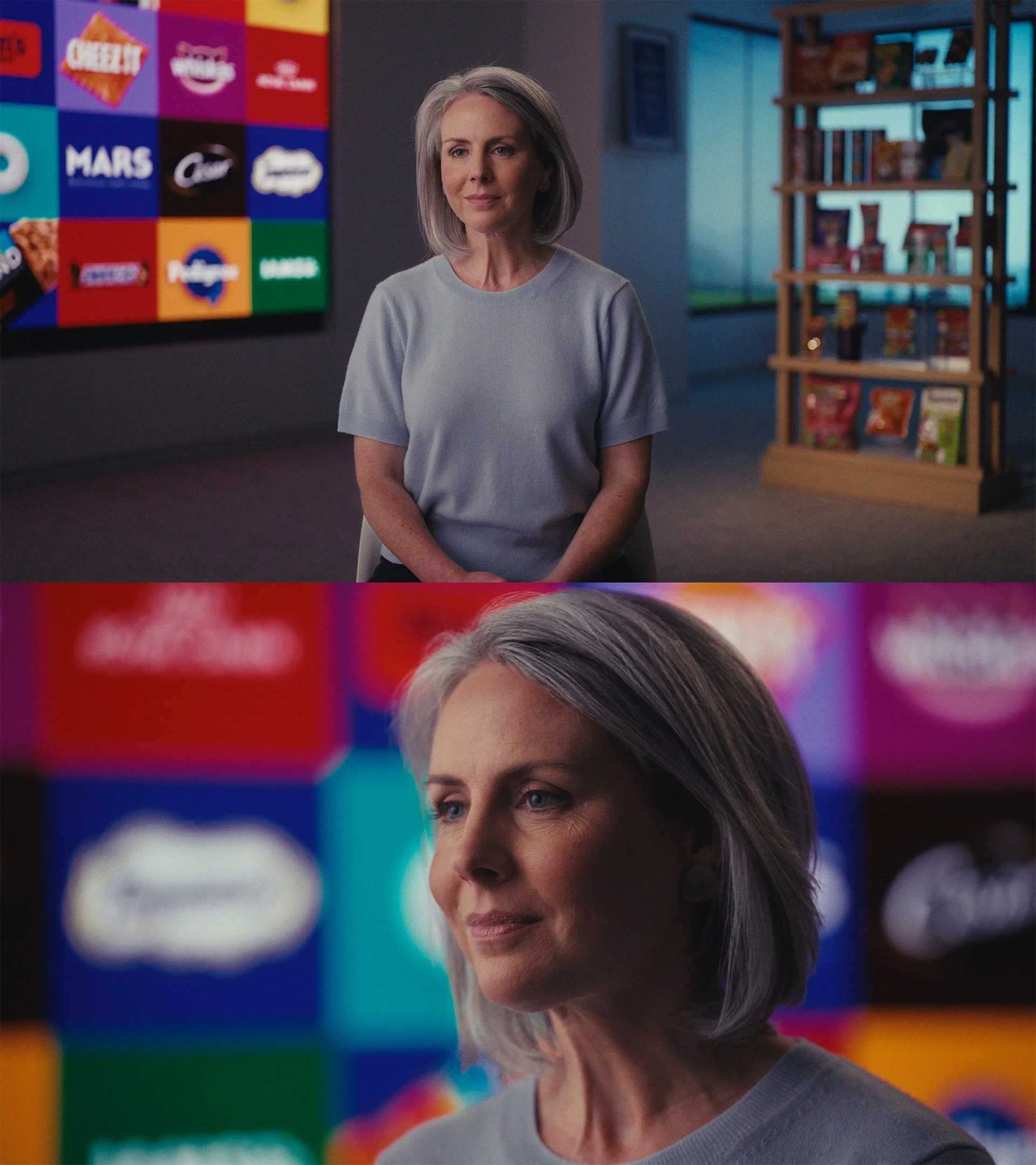
We asked the MARS design team to create a checkerboard of their logos to throw up on the video wall (screen left). Production design that pushes the story forward and looks good is always a big win. We then put an image of a landscape/sky on the TVs (screen right). The warm and cool contrast helps with separating the image and makes things feel more three dimensional.
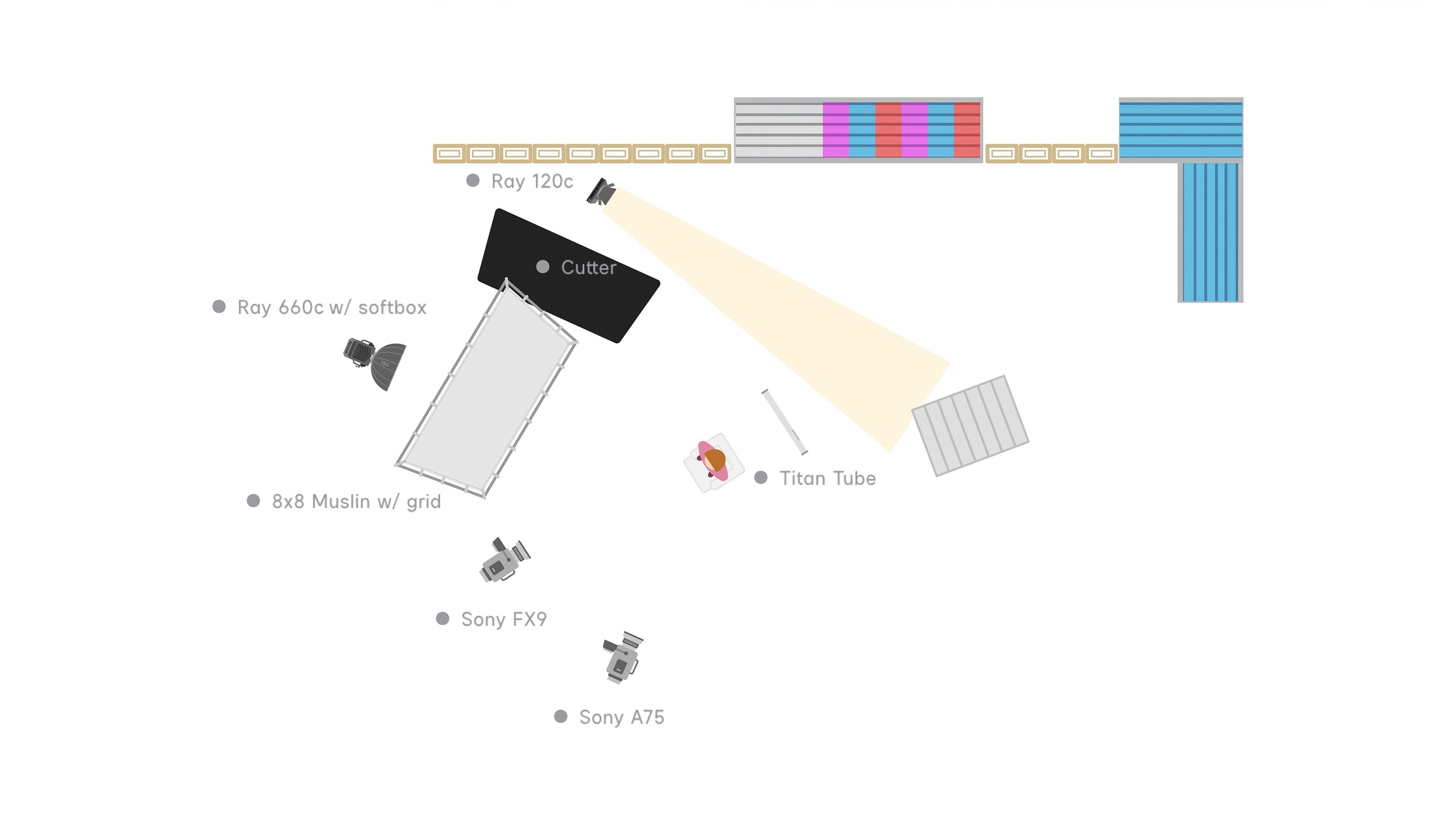
From a lighting standpoint, we went fairly minimal. In order to get that big wrap around the face, we double broke a softbox through bleached muslin. Double breaking is essentially just using more than one piece of diffusion with distance between them to get the absolute softest source. An 8x8 grid on that was essential to keep the light focused on our subject and not spilling all over the background. Had we not had the grid on, the background colors wouldn't be as rich.
When you've got the setup in a good spot, you can look for smaller wins to make things pop. 1% increments really add up through the day. We shot a warm spotlight hit on the shelves in the background (screen right) that added a layer of color contrast. Really makes the image feel balanced.
These are the final frames:
The artifact room
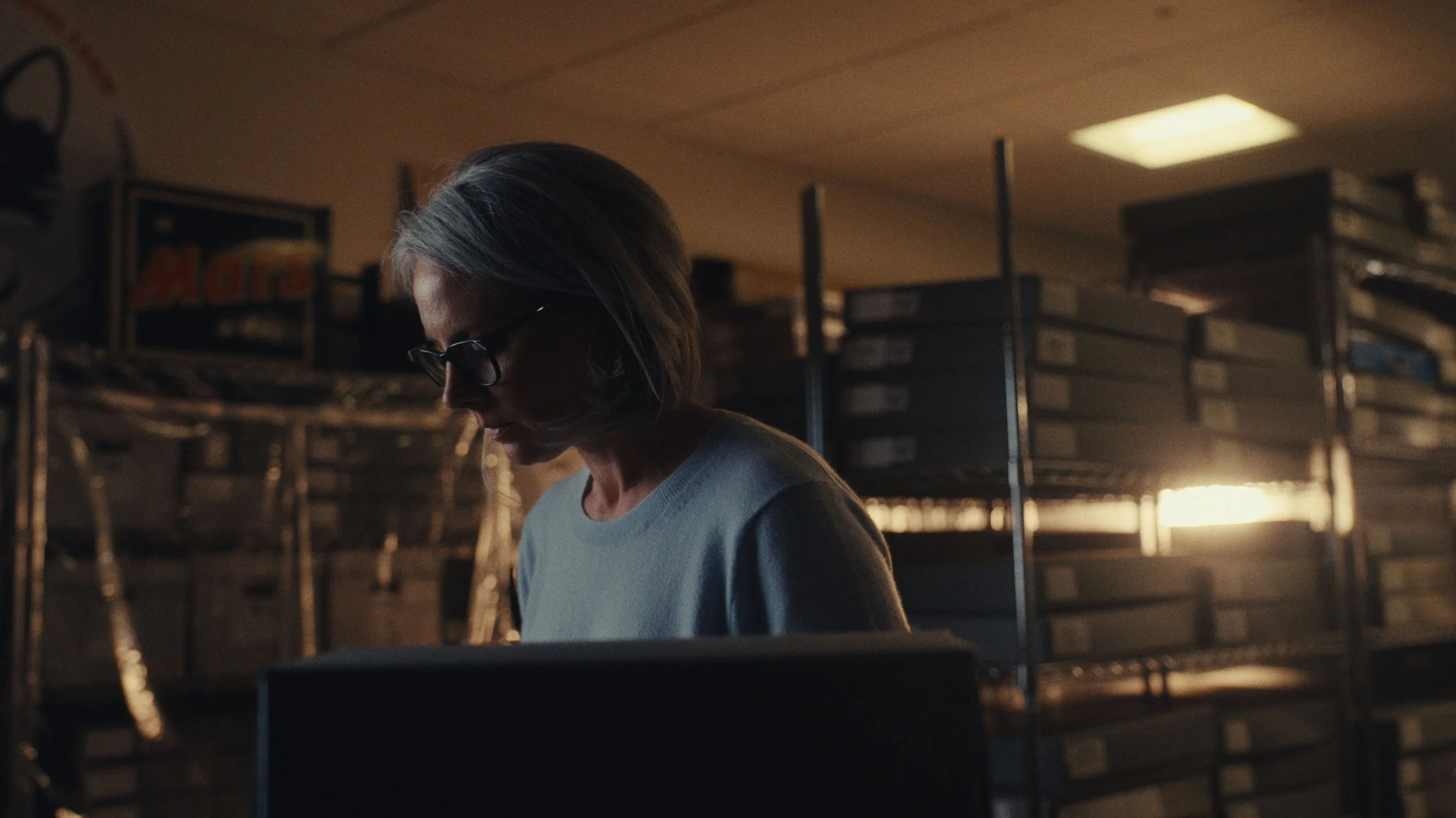
A big emphasis of the short doc was the history of MARS - dating back to all of the original products. In it's simplest form, creating a look is just casting an overarching feeling over the scene. For this, we felt that the revisiting of artifacts called for warmer tones - loosely based on Indiana Jones.
Here are a few spliced together clips from that room:
We're more than likely working with regular, non-actors, in branded documentaries. Because of that, it's important to give them space to move freely and express themselves as they would. In practice, that means lighting the spaces and not faces. Meaning, using more broad lighting as opposed to shifting things around for every shot. The latter is done mainly in commercial and narrative work.
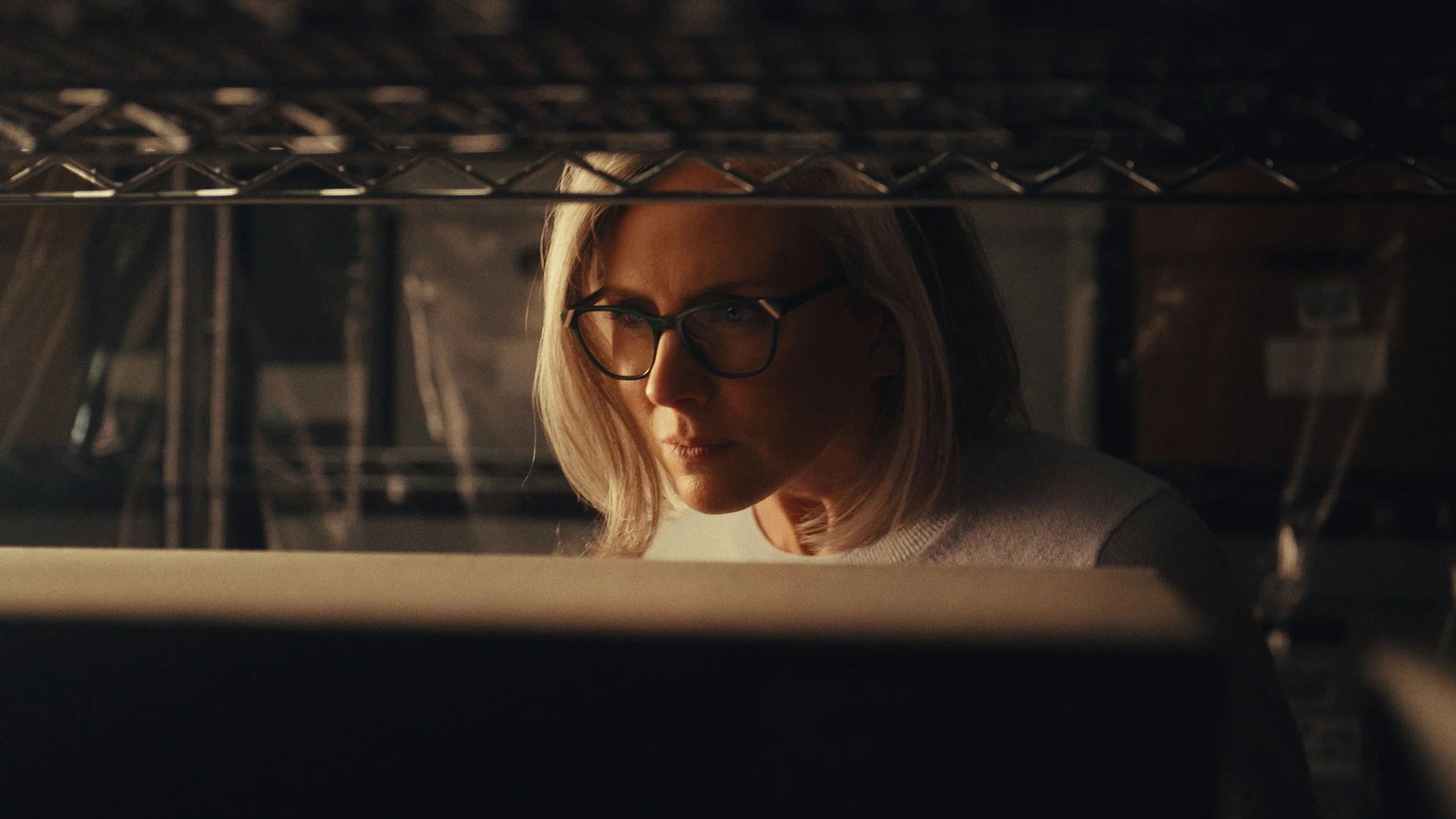
In this doc, we started by turning off all of the lights in the foreground and left the background ones on. We wanted full control over the direction/color/intensity of our foreground. We then placed several lights in the deep background to backlight everything. That introduced lots of contrast points and made the shelves of artifacts more three dimensional.
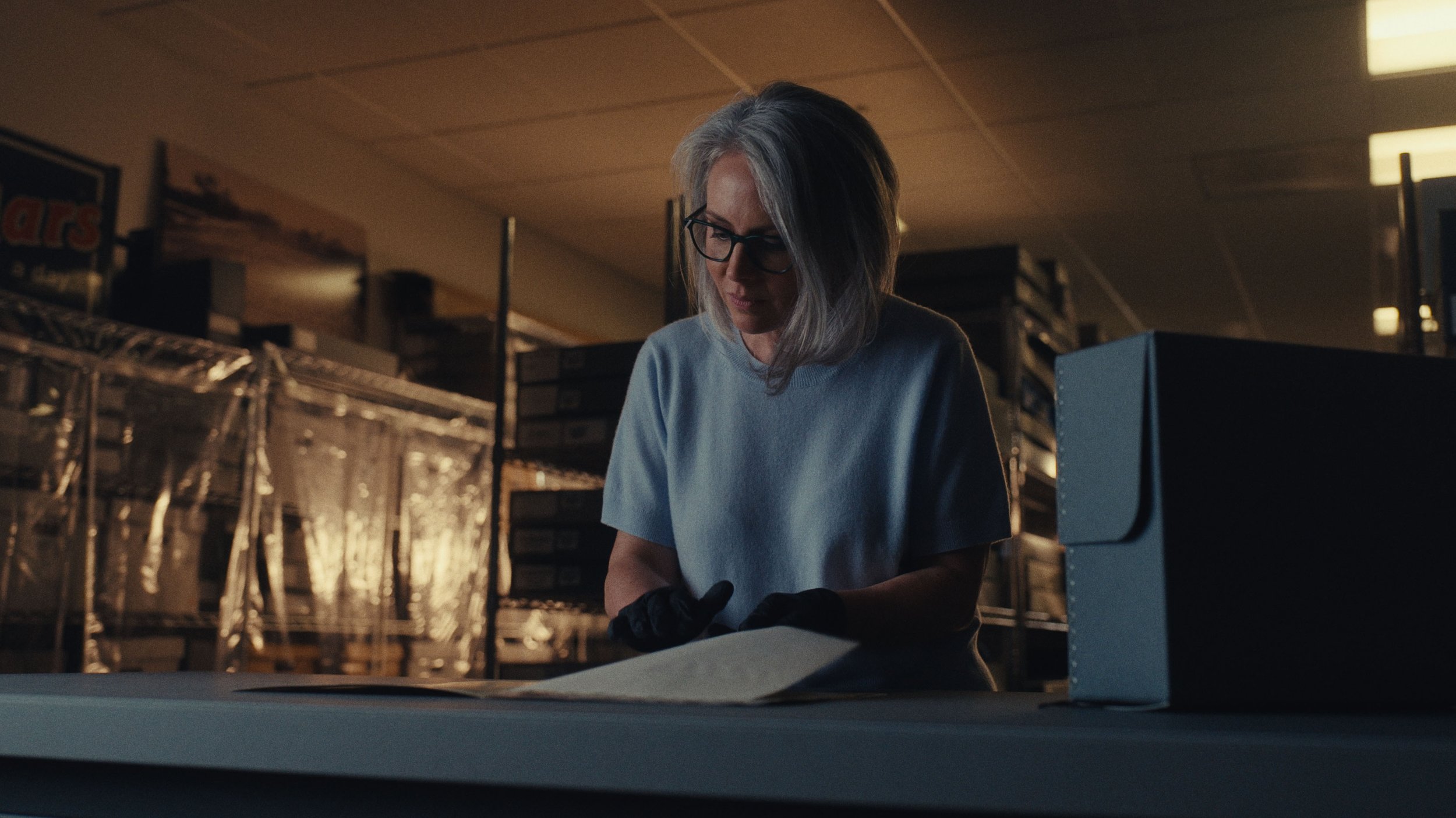
The foreground was lit with a much cooler color temperature. The added color contrast carves out the subject and leads the viewers eyes to them.
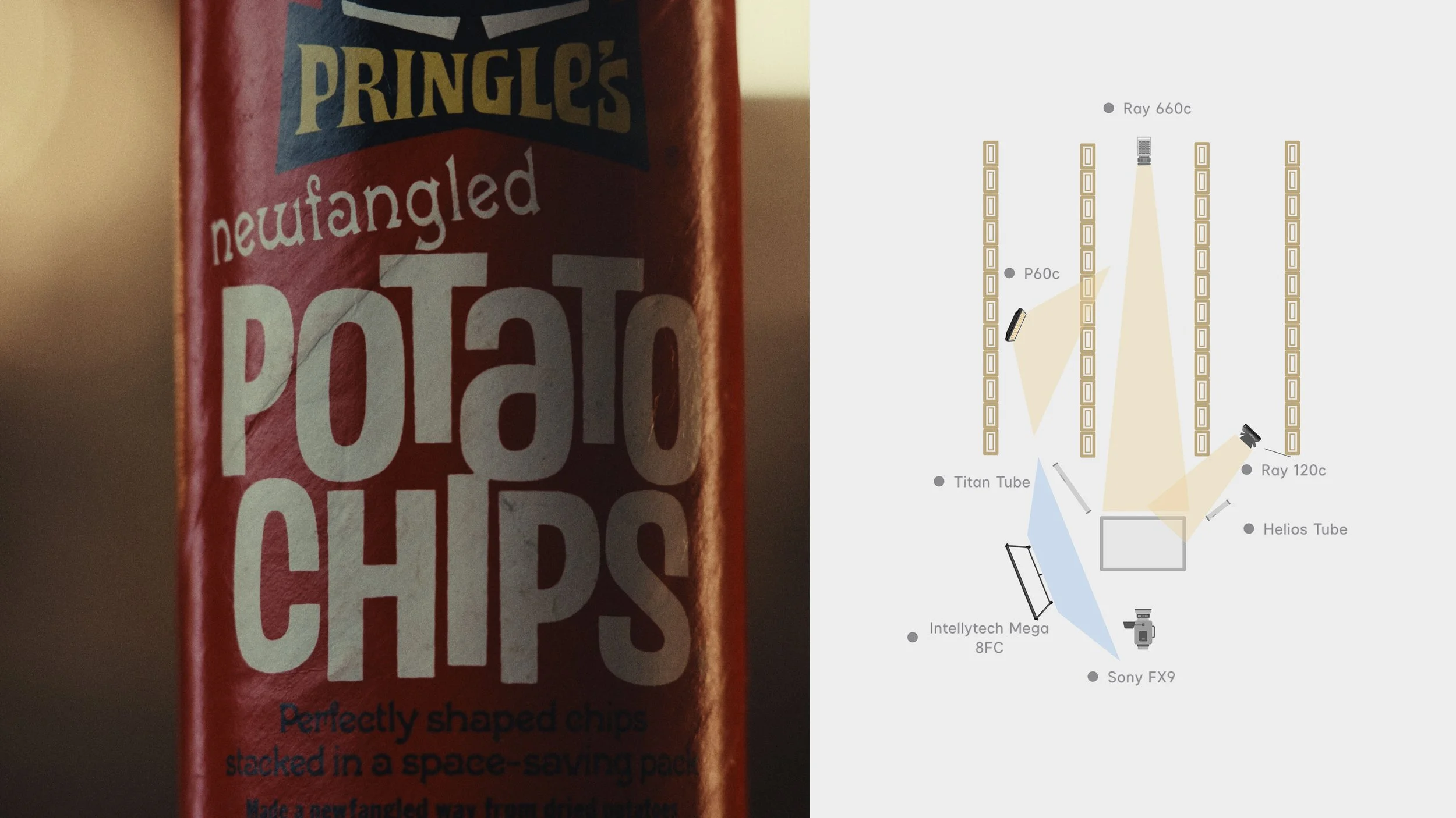
For product shots specifically, using tube lights to edge the product out works great. You can see the effect below on the sides of the pringles can. What you're seeing is the actual reflection of the tubes. You don't need a ton of light output to do that - it's more about the shape.
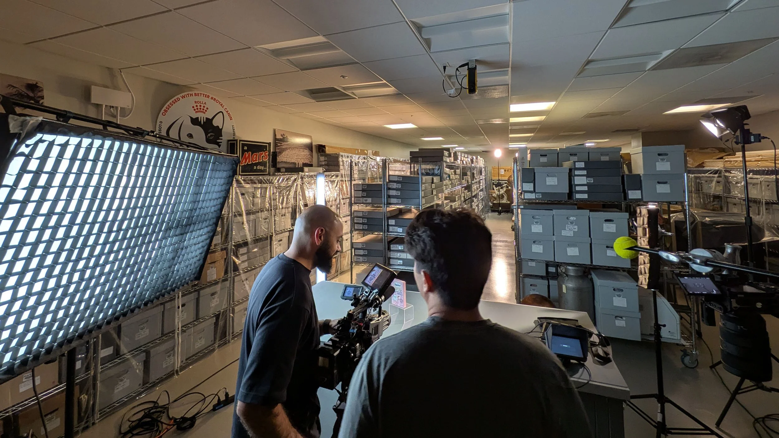
When thinking about cinematography, it's easy to get caught up with making everything look beautiful. While that is certainly a part of it, being able to keep a look consistent between shots will help keep viewers in the piece and make the lighting invisible. If you think you can keep up a creative look through a shoot, I'd highly recommend it. The only way to become more comfortable doing that on the field is by getting reps in.
If you like this, consider sharing with a friend! Happy to answer questions about any of this - feel free to shoot me an email at ahmadasaadDP@gmail.com
If you’d like to follow my work, I can be found on Instagram @ahmadasaaddp
