
Building Sets That Work (And Feel Real)

Building Sets That Work (And Feel Real)
If you're in the marketing or film industry, it's very likely you'll be a part of creating a set. They can be as minimal as adding props to a background, or as complex as constructing a room from scratch. In any level of production, an intentional approach to your set will streamline your workflow and amplify the narrative.
My name is Ahmad and I’m a Director of Photography in Washington D.C. - working on documentaries, commercials, and narrative films. In this guide, we'll walk through two set builds - learning key concepts and increasing in complexity as we go.
Before the Build: Questions to Ask Yourself
Why am I building a set?
The biggest reason to build a set is to create a space that is specifically tailored to your needs. You're making decisions for your project, not taking what a location gives you and going with it. It also allows you to be up and running quickly every day and maintains the same look across months or years of shoots.
A blank canvas can be scary. What should it look like?
You're mainly looking to create a space that represents the host/character and reflects the themes in your project. Understanding this early on can be an easy and cost efficient win that will elevate the storytelling and production quality. Something that helps immensely with this is creating a list of all the possible places your character spends time in. You'll begin to have deeper conversations with the team about what they're doing in those places and the items in the room that are significant. You're generally looking to build out a character persona to look back at through the build process.
How much room do I have?
While more space to work with can make things easier, you can still create something great with a portion of a room. If I were to distill cinematography into one word, it would be "depth". Depth can come from physical space, but it can also come from much less talked about factors such as layering color, light, and objects.
Case Study #1 - Host Led Show
In this first example, we'll go over a few concepts during the set build for host-led show. This was designed and built from scratch by a small and mighty crew of 4: Sana Saeed, Nicholas Garbaty, Kutlay Dede, and I.
This build will cover a background/world that exists only in the frame. Designing your set in this way is great for keeping cost low.

Setting a foundation
If you have a space with walls you can paint/design, you're already ahead here. If you're starting fresh, the first thing you'll want to to is measure how wide you want your shot to be. An easy way to do this is to place the subject and camera roughly where they would be, and use objects in the background as placeholders to see how much of the space you need to fill for that specific frame. A safe place to start is 35mm focal length on the lens while maintaining roughly 5ft of distance from the subject.
Construction
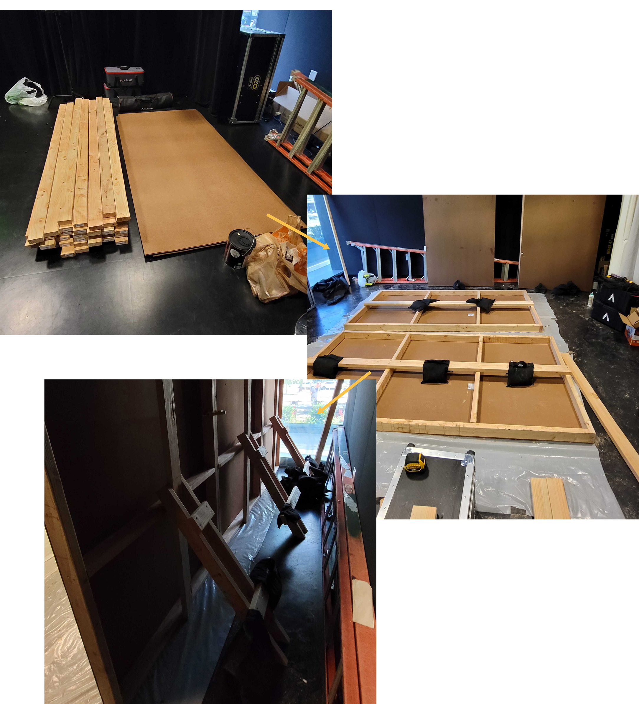
When you've figured out how much of the background you need to create, the next step would be to build set flats. Set flats are essentially movable walls that are held up by jack stands. They are usually 4ft wide and 8ft tall. Most Art Directors and Production Designers can build these for you, but if you're low on budget and need to do it yourself (as we did), it isn't all that difficult.
There are a few great Youtube videos detailing how to build set flats. I highly recommend you watch a few to familiarize yourself with the process, as those tutorials go more in depth than we can here. For our build, we went with a culmination of a few methods. They are generally just 2x4's cut to specific lengths and screwed/glued onto an MDF board.
Set Design
This is where a lot of the earlier research comes in: what space is my character in and what themes are we trying to get across? For this project, the host was a journalist and researcher, so we wanted to create a space that felt professional while maintaining a home-y feeling. A good mixture of credibility + the feeling that a friend is talking to you.
Wall Treatment
Adding color/texture to the walls is going to be the biggest bang for your buck. Generally, you want to avoid white or black walls, as they get brighter or darker than everything else faster and you'll quickly lose control over the contrast in the room. The color you choose for your project will depend entirely on the mood you're going for. A good starting point is to look for deep colors that are about 40% in the scale of brightness. This will help your subject pop as they'll pick up light faster than the background. You can use paint or wallpaper - we used both in this set.
We also painted square wall molding and used adhesives to attach them - adding another layer of texture.

Props
A formulaic way to thing about this is: what can I place in the background to break it up while maintaining the design scope? If you're on a budget, thrifting is an amazing way to find props with character. Lamps, plants, furniture, books, and trinkets are all great props for office environments.

Lighting/Special FX
The show is about how the media has originally told stories - then how they can be retold in a better way. To emphasize that, there’s a lighting change that happens about 75% through every episode. We go from night to day - signifying a more positive approach. We also included special segments that have news or archival clips projected onto the background.
Let's briefly go over specific lighting concepts and what made each look stand out.

Lighting in zones
If you're looking to have better control over the lighting in the space or create different looks, lighting in zones can make things easier for you. It's the concept of lighting the foreground and background separately. For example, we could turn off the light on our subject here and it wouldn't affect the background (and visa versa).
Day
When designing the set, we knew we wanted a window to be off camera to the left (while there isn't one in reality). That gives us a unified direction that our background and foreground lights can come from.
To create the streaks on the wall, we shot a light from the other side of the room through a plastic tree branch and into acrylic mirrors with tape on them. The tape mimics window frames in the reflection while the tree branch creates the feeling that there was a tree right outside.
Night
Having lamps built into your set design are a great way to have variability in lighting. When turned on, they produce small pockets of interest. For the night look, we mainly shifted the overall color of the background lights to a cooler color temperature and turned on the lamps.

Projector
The projector allowed us to display images on the background in real time - a fresh perspective from just relying on broll. This was done by mounting it above the desk and plugging it into a laptop. We simply played the clips in Premiere Pro so we had total control over the color, brightness, and timing.

For this look, all of the background lights were turned off to maintain the highest level of contrast.

Case Study #2 - Narrative Set
In this example, we'll skip over some of the concepts covered previously and look at more complex ones. This set was also designed and built from scratch by a small and mighty crew: Saarah Khan, Youssef Belefqih, Fawzi Yahya, Momin Baig, and I.
The build was made to be used as a whole room in a narrative film - freely moving the camera and characters through it. The room develops as the character goes through different arcs and can be lit for any time of day.

Layout/Design
Led by Saarah Khan, we worked to design the character's home library that could seamlessly cut together with the on-location shoots we had. All of the walls and bookshelves were created as custom set flats - a level of detail much greater than in the previous case study. We brought in Youssef Belefqih, a woodworker and set builder, for the construction portion of the project.

You may ask, why not just shoot at a real library?
This comes back to a question we asked ourselves at the beginning of this guide. Having a set in studio that looks like a real location has major advantages: you could access it at any time, pick up where you left off from the day before fairly quickly, have total control over the time of day/weather in a scene, and can more efficiently merge the design of the character and set. All of these factors end up saving the production time and money in the long run.
Lighting
An intentional and thorough approach to lighting is one of the biggest factors in making a studio set feel real. Since this was being edited between other on-location scenes, our lighting approach had to be naturalistic. Let's go over a few key concepts that helped us achieve that feeling:
Motivating the Light Source
To make your film lights feel invisible in a scene, you're generally looking shoot them from the same direction that the natural light is coming from. If you have a window in the room, an easy way to do this is to show the window in the background and place your film light on the same side of the set.
In the design phase, we placed a window on the far side of camera and in the shot. It gives the viewer a reference point where all of the lighting "should" come from. In reality, it isn't contributing all that much to the scene in the ways of illumination. Most of the light being pushed into the scene is coming from fixtures above the walls. This gives you the most control in your lighting, can help you create different looks, and give the actors an area they can freely work in.

Creating Realistic Sunlight
Sunlight is made of two things: the actual hard sun beam (a spotlight) + all of the additional ambient light from the sky. You can create practically any time of day with control over those two variables.
The best way to digest this concept is to study real life. Next time you're outside, observe the color of the hard sunlight and the color of the shadows. Shadow color generally takes the color of the sky. So, during a warm sunset with indigo blue skies, the direct sunlight will appear warmer while the shadows are cooler.

Window Treatment
Since the window is in the shot, we'll need to place something behind it to make it seem like the real world is out there and not a studio. There are several ways to do this. You can: use a projector to display an environment onto a sheet, actually print that environment onto a banner, or create a white/colored void that is up to interpretation if the view outside isn't story-dependent (this is what we did for the set build).

We installed sheers on the window and lit up a 12x12ft sheet of muslin behind it. In between the two are a few plants as an added layer of texture.

Respecting the Camera's Dynamic Range
A sometimes overlooked aspect of lighting in studio builds is the balance of staying within the bounds vs exceeding the dynamic range of the camera. For example, it's almost impossible to properly expose the inside of a room without blowing out a window that's in the shot. Because of that, over-exposing the window in many situations can make things feel more real (night time being the outlier). The viewer can subconsciously pick up on these things, so sometimes accuracy is more important than keeping everything correctly exposed.

Inverse Square Law
You may be thinking: why not just put diffusion directly on the backside of the window? Wouldn't that be more efficient than how it's currently set up? If your resources are limited, diffusion directly on the window is the direction I'd recommend going. It can be done by taping tracing paper to the backside of the window and lighting it up. The sheers will break up any imperfections.
If the resources are available to you and you're going for a more physically accurate approach, you'll want your diffusion to be further from the window frame. This is where the Inverse Square Law comes into play - a law of physics stating that light will get darker (or fall off) much faster the closer it is to a light source.
The easiest way to observe this right now is using your phone's flashlight. Place your palm 2 inches from the light and move it further to 4 inches away. Take note of the difference in brightness. Now do the same thing with 1 foot to 2 feet. Even though you're moving your palm a farther distance, you don't necessarily have the same relative drop in brightness. Lights work exponentially, not linearly.
Going back to the set build. The reason we didn't place the diffusion directly on the window is because then the window itself would become the light source. That means the walls near the window would become very bright relative to the rest of the room (similar to the difference in the previous example with your palm). By backing off the diffusion a few feet, we essentially skip the closest ramp down of the inverse square law - leaving a more gradual light fall off for the room. Observing the real world, we know that the sky is miles away, so anything we can do to mimic a sense of distance is a win.

Building a set is an amazing way to streamline workflows and amplify storytelling. Whether you're setting up a simple background or a full blown film set, all of the nuanced decisions you make come together to form something truly unique - and that is extremely powerful in this day and age.
If you like this, consider sharing with a friend! Happy to answer questions about any of this - feel free to shoot me an email at ahmadasaadDP@gmail.com
If you’d like to follow my work, I can be found on Instagram @ahmadasaaddp